Taking on non-MLB/MiLB team uniforms is just a crazy task. The nice, universal graphic styles aren't there like football. So yeah. We're going to switch it up. Let's take a look at my favorite Major League Baseball uniforms & logo sets.
It's no secret that I grew up as a Philadelphia Phillies fan. So let's start with the Phillies. The 80's powder blue road set is kind of everyone's favorite Phillies' look. But there was a short period of time between the powder blues and the current incarnation of the Phillies' look that I think is wildly overlooked.
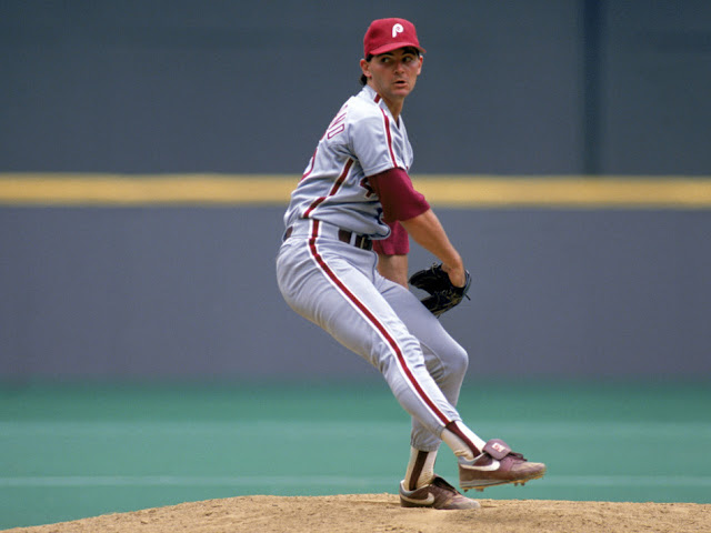
In 1989 the Phillies started a shift from the glory days of the 80's to their one-shot World Series run in 1993. The shift started with the team dropping the powder blue roads and moving to the light grays they've worn since. Then 42 games into the season, Mike Schmidt announced his immediate retirement. Without going to retrosheet, if memory serves, the Phillies were in San Francisco. The day after the announcement, Rick Schu went out to play third. Charlie Hayes moved into the everyday slot on the left side (and made his mark by costing Terry Mulholland a perfect game, but then saving the no-hitter).
The gray & maroons only lasted three seasons, but themselves were throwbacks to the 1970's look the team used bridging the Connie Mack Stadium to Veterans Stadium eras. By 1992 when the new logo appeared, the Phillies were a completely different team. The pieces of the '93 World Series squad were coming together.
The uniform set doesn't get it's due for two reasons. First, it's small but significant change from the 80's look, which is still the most popular jersey in team history. Second, it only lasted three seasons. It was a placeholder while the team came out with the look they've had ever since.
The classic maroon red fat P has always held a special place to me, and in contrast to the newer cherry red, I prefer the darker and more robust logo. The older logo translates better across TV, where the newer lighter red turns pink, particularly on the home pinstripes.
The balance of maroon off the road gray also works better than the modern light red. The darker tone of maroon popping harder off the light gray versus the new red being about the same tonal color as the gray.
For the Phillies, if they were to return to the maroon and white logo, bringing it back with the gray road look would keep the look modern. It would be a good base to fit in with the revisit looks like Brewers, Padres and Giants have brought out recently.
The Phillies are overdue for a rebrand. The freshened up look at the team introduced in 2018 was less a rebrand than "Look, now the Liberty Bell is blue instead of white". Returning to the look that a lot of us middle-age fans remember from our childhood, while keeping it fresh and on trend.


No comments:
Post a Comment